The short version: In 2026, a well-designed website is fast for real visitors on real phones, usable by everyone including people with disabilities, and structured so that both people and AI search tools can understand it at a glance. The flashy stuff matters far less than it used to. The fundamentals matter more.
At the end of 2024 I wrote a post on modern website design techniques for 2025. Some of it held up well. Some of it aged about how you'd expect anything with "AI-driven personalization" in it to age. (I went back and graded that post honestly -- it's worth a read if you like seeing someone own their predictions.)
This is the version I'd hand a Tulsa business owner today. It's not a trend list. It's what I actually check on every site I build or rebuild, in the order I'd prioritize it, with the reasoning behind each one.
1. Performance Is Now Measured by Your Real Visitors
The biggest shift in the last couple of years isn't a design style. It's how speed gets graded. Google's Core Web Vitals are scored on field data from actual Chrome users, at the 75th percentile, with mobile and desktop judged separately. That means your site doesn't pass because it's fast on your office computer. It passes when it's fast for three out of four people visiting it, on whatever phone and connection they happen to have.
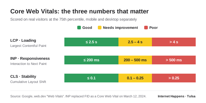
The three numbers:
- Largest Contentful Paint (LCP) -- how quickly the main content shows up. Good is 2.5 seconds or less.
- Interaction to Next Paint (INP) -- how quickly the page responds when someone taps or clicks. Good is 200 milliseconds or less. INP officially replaced the older First Input Delay metric on March 12, 2024, and it's much stricter: it watches every interaction during a visit, not just the first one.
- Cumulative Layout Shift (CLS) -- how much things jump around while the page loads. Good is 0.1 or less.
What this means in practice: every image gets real width and height attributes so the layout doesn't shift, images are served in modern formats like WebP or AVIF, the hero image is never lazy-loaded, and third-party scripts (chat widgets, heat maps, five different tracking pixels) get cut down to the ones that actually earn their keep. Heavy page builders are a common culprit when INP scores suffer, which is one reason I've been building leaner. More on that in why I moved my own site off WordPress.
2. Accessibility Is the Baseline, Not a Bonus
The current version of the Web Content Accessibility Guidelines is WCAG 2.2, which became a W3C Recommendation in October 2023. On the legal side, the Department of Justice adopted WCAG 2.1 Level AA as the technical standard for state and local government websites under ADA Title II. In April 2026 the DOJ pushed those compliance dates back a year -- to April 26, 2027 for larger public entities and April 26, 2028 for smaller ones -- but the standard itself didn't change.
If you're a private business, there's no equivalent federal technical rule for you yet. That doesn't mean you're in the clear. Accessibility lawsuits against private businesses still happen, and the federal government has now signaled which technical standard it treats as the benchmark. More importantly, accessible sites are simply better sites. Good contrast, clear focus states, labeled form fields, real alt text, and descriptive link text help every visitor, and they help search engines too.
I'll be honest about my own site: an audit this year caught low-contrast footer text and gold-on-white links that didn't meet contrast requirements. Both got fixed. Nobody gets this perfect by accident -- you have to actually test.
Quick self-test: Unplug your mouse and try to use your website with only the Tab and Enter keys. Can you see where you are on the page? Can you reach the phone number, the menu, and the contact form? If not, a real share of your visitors can't either.
3. Design for Two Audiences: People and AI
This is the genuinely new part. Your website is now being read by Google's AI Overviews and AI Mode, by ChatGPT, by Perplexity, and by whatever comes next. Google's own guidance is clear that there's no special trick here: the same SEO best practices apply to its AI features, and a page has to be indexed and eligible to show a snippet to be included at all.
What that looks like in design and build decisions:
- Real HTML text, not text baked into images. If your services are listed in a graphic, machines can't read them reliably.
- A clean heading structure. One H1, logical H2s and H3s, each section answering one question.
- Answer-first paragraphs. Lead with the direct answer, then explain. It's better for a hurried human and much easier for AI to quote accurately.
- Structured data that matches what's on the page. Business name, address, phone, hours, services -- marked up with schema and kept consistent everywhere else your business is listed.
If the alphabet soup of AI search terms is confusing, I break it down in AIO vs. GEO vs. SEO.
4. Modern CSS Replaced a Lot of JavaScript
A few years ago, making a layout adapt intelligently or detecting a visitor's dark-mode preference often meant pulling in JavaScript libraries. Today, most of that is built into CSS and supported by every modern browser:
- Container queries let a component adapt to the space it's placed in, not just the screen width -- so a service card looks right in a sidebar and in a full-width row.
- The
:has()selector lets styles respond to what's inside an element, which eliminates a surprising amount of scripting. - Native dark mode via
prefers-color-scheme, and reduced motion viaprefers-reduced-motionfor visitors who get motion sickness from animations. - View transitions for smooth page-to-page animation, which modern browsers support and older ones simply skip.
Less JavaScript means faster pages, fewer things to break, and better INP scores. It's one of those rare cases where the modern approach is also the simpler one.
5. "Mobile-First" Is Just "First" Now
Google crawls and indexes sites primarily as a smartphone would see them. For most local businesses, the mobile version of your site is your website as far as search is concerned -- and it's usually what your customers see first, too.
Designing mobile-first in 2026 means thumb-sized tap targets, a phone number that's one tap away on every page, forms short enough to complete on a phone, and nothing important hidden behind a menu that only works on desktop. And if phone calls are how your customers reach you, you should be measuring them -- I walk through that in how to track phone calls from your website.
6. Trust Is a Design Problem
Two sites can rank side by side and one gets the call. The difference is almost always trust: real photos instead of stock, named people with real bios, recent reviews, a clear service area, pricing guidance where it's appropriate, and contact information that's easy to find and consistent with your Google Business Profile. I cover this in more depth in the online visibility guide, but from a design standpoint the rule is simple: every page should make a nervous first-time visitor a little more confident about calling you.
7. Leaner Builds Win
The sites I see struggling the most are rarely the simplest ones. They're the ones carrying years of plugins, a page builder generating heavy markup, and scripts nobody remembers adding. That doesn't mean everyone needs a hand-coded site -- WordPress is still the right call for plenty of businesses, especially ones that publish a lot or need non-technical staff editing pages. But whatever you're built on, the goal is the same: ship only what the page actually needs.
What Faded Since Last Year
A few things I'd de-emphasize compared to the 2025 list:
- Heavy parallax and scroll-triggered effects. They tend to hurt performance and can be genuinely unpleasant for people sensitive to motion. Subtle beats showy.
- AI-driven on-site personalization for small businesses. AI changed how customers find websites far more than how websites should look. For a local service business, that's where the attention belongs.
- App-like frameworks for brochure sites. A five-page service business site almost never needs a single-page JavaScript application. Fast, server-rendered HTML is still the right default.
A 2026 Checklist You Can Actually Use
| Check | Why it matters | How to test it |
|---|---|---|
| Core Web Vitals pass on mobile | Real-visitor speed; a Google ranking factor | PageSpeed Insights or the Search Console Core Web Vitals report |
| Keyboard navigation works | Accessibility and usability | Tab through the page with no mouse |
| Text contrast meets WCAG AA | Readability for everyone | Lighthouse accessibility audit |
| One H1, logical headings | Readers and AI both parse structure | Browser extension or view the outline |
| Phone number tappable on every page | Most local leads start on a phone | Open the site on your own phone |
| Business info matches everywhere | Consistency builds trust with Google and AI | Compare site, Google Business Profile, and directories |
| Images have dimensions and alt text | Prevents layout shift; accessibility | Lighthouse audit |
Where to Start
If you only do one thing this month, run your homepage and your most important service page through PageSpeed Insights on mobile, then do the keyboard test above. Those two checks will tell you more about the real state of your website than any trend article, including this one.
If you'd rather have someone who's been doing this for 25+ years take a look, that's exactly the kind of review I do for businesses through my Tulsa website design work. No agency markup, and you'll be talking to the person who actually does the work.